AEM Style System enables a user-friendly interface, for non-technical users who can easily make style adjustments, fostering creativity and agility. Integrating seamlessly with Adobe Experience Manager, the AEM Style System enables content authors to apply predefined styles effortlessly, maintaining brand consistency across platforms and devices. As developers are trying to create new AEM component’s this feature must be enabled in order to utilize the AEM Style System feature.
In this blog article, I will be showing you how to enable AEM Style System for your component it’s frankly just a configuration from the
cq_design_dialog or as developers know it, _cq_design_dialog/.context.html.
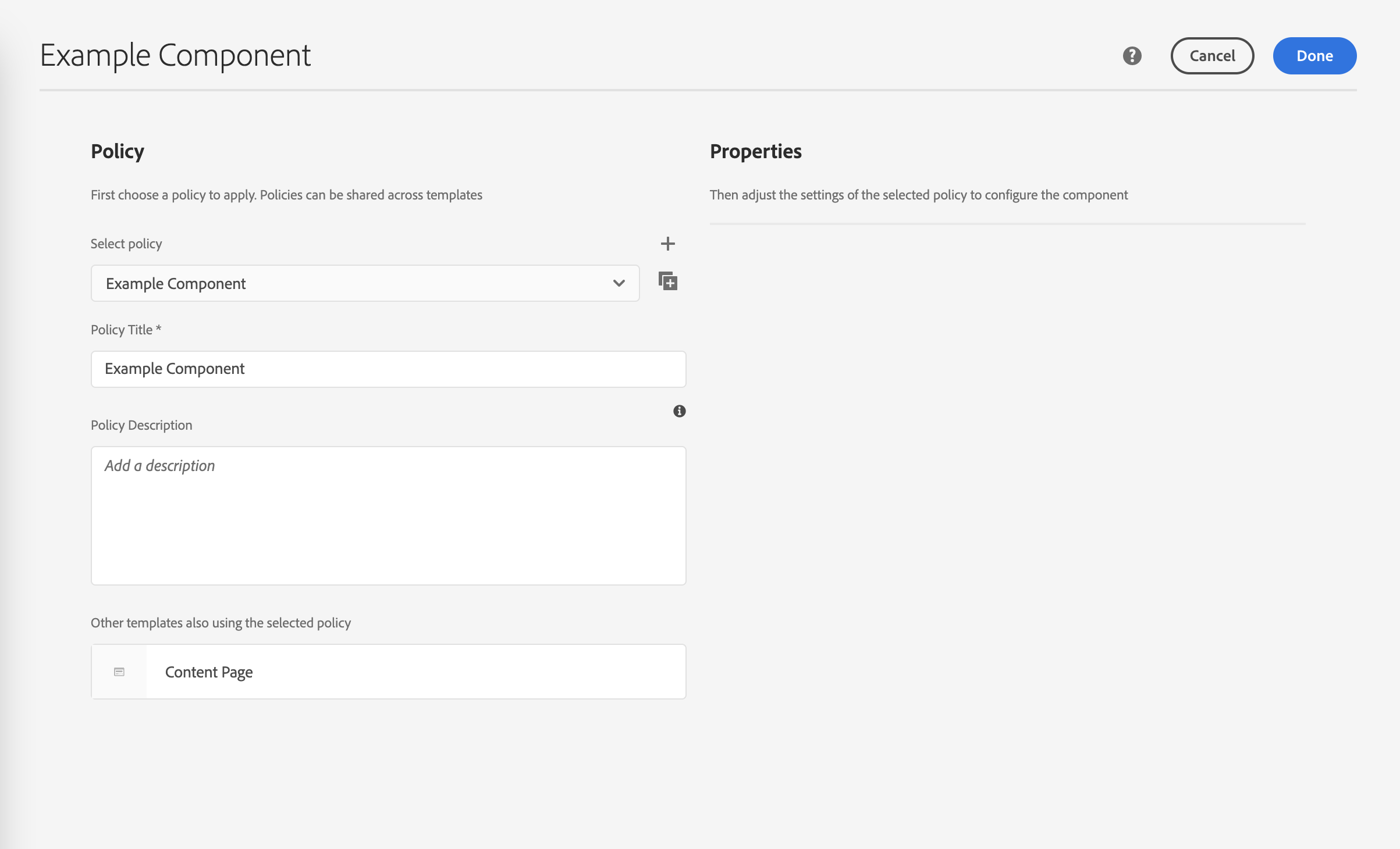
1. Disabled Style System
Without the Style System enabled for a component, the component policies page would look like this:
2. Adding code configurations
The quickest explanation of why the style system is not visible in the component’s policies is that you have a missing configuration for the cq_design_dialog. In the instructions below, we will include some code configurations to enable your target component’s AEM Style System feature.
- Create a “_cq_design_dialog” folder under /apps/sourcedcode/components/examplecomponent
- Create a “.content.xml” file under /apps/sourcedcode/components/examplecomponent/_cq_design_dialog with the file contents below:
- Line:15-18 is the code block you should include in the _cq_design_dialog/.content.xml.
1
2
3
4
5
6
7
8
9
10
11
12
13
14
15
16
17
18
19
20
21
22
23<?xml version="1.0" encoding="UTF-8"?>
<jcr:root xmlns:sling="http://sling.apache.org/jcr/sling/1.0" xmlns:cq="http://www.day.com/jcr/cq/1.0" xmlns:jcr="http://www.jcp.org/jcr/1.0" xmlns:nt="http://www.jcp.org/jcr/nt/1.0"
jcr:primaryType="nt:unstructured"
jcr:title="Example Component"
sling:resourceType="cq/gui/components/authoring/dialog">
<content
jcr:primaryType="nt:unstructured"
sling:resourceType="granite/ui/components/coral/foundation/container">
<items jcr:primaryType="nt:unstructured">
<tabs
jcr:primaryType="nt:unstructured"
sling:resourceType="granite/ui/components/coral/foundation/tabs"
maximized="{Boolean}true">
<items jcr:primaryType="nt:unstructured">
<styletab
jcr:primaryType="nt:unstructured"
sling:resourceType="granite/ui/components/coral/foundation/include"
path="/mnt/overlay/cq/gui/components/authoring/dialog/style/tab_design/styletab"/>
</items>
</tabs>
</items>
</content>
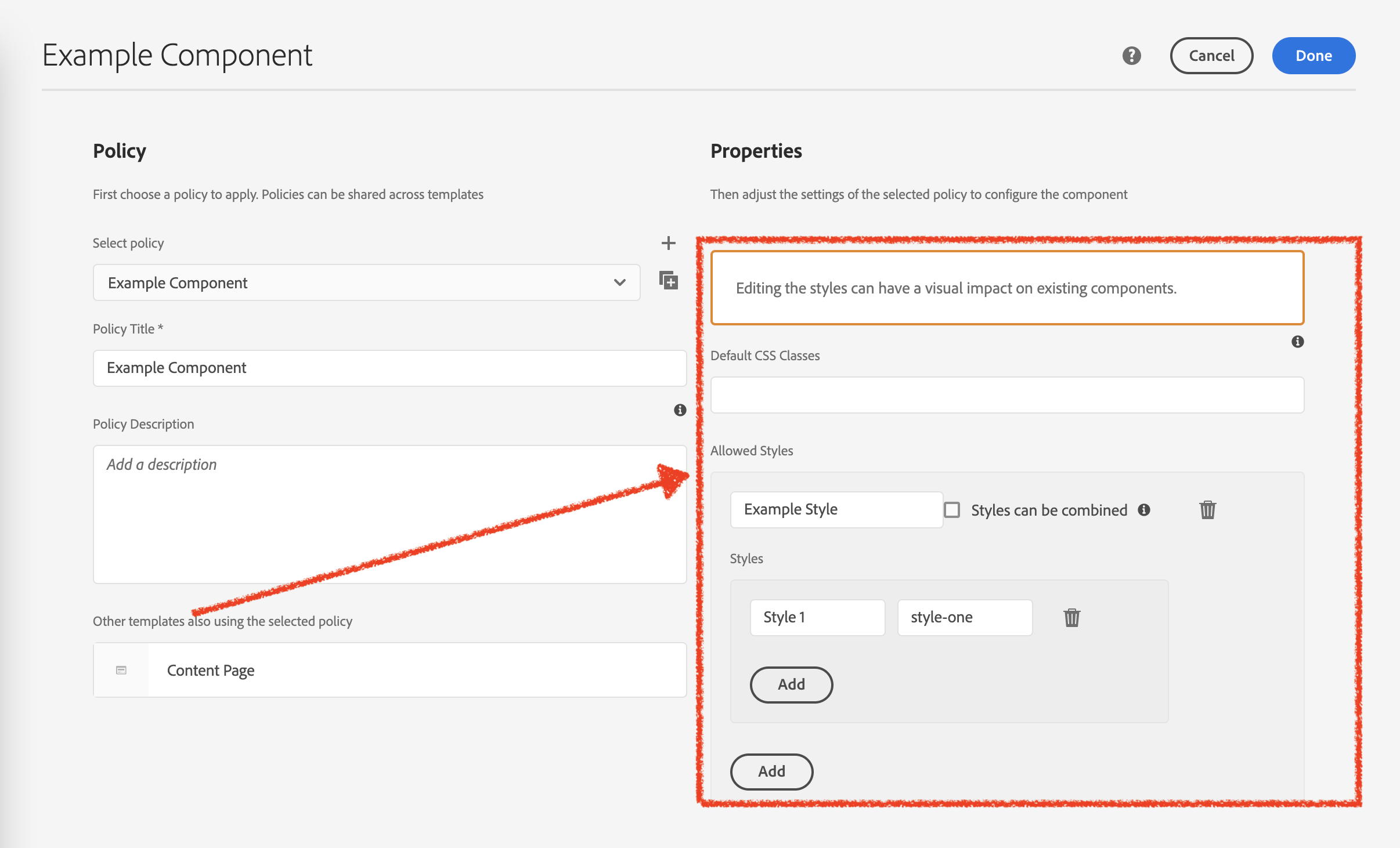
</jcr:root> - We are utilizing the out-of-the-box AEM utils “/mnt/overlay/cq/gui/components/authoring/dialog/style/tab_design/styletab”, which enables the AEM Style System feature for your target component.
- As a result, you should see something like this now. Make sure you configure the input fields indicated in red, and then continue on with the next instructions of this list.
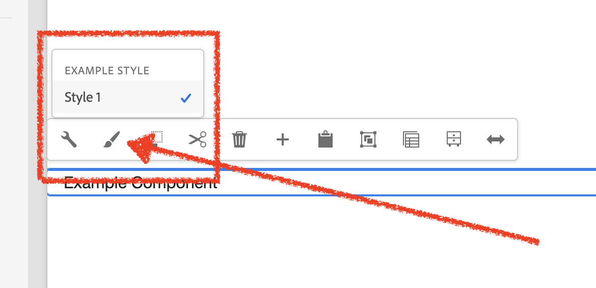
- When editing the component, you should see a “paintbrush” indicating that the style system configuration is working as expected. Click on it, and you should see the style configurations that we have configured in step 5.
- Done
Add AEM Style System in Touch UI (popup)
Though we have configured and enabled the AEM Style System in the cq_design_dialog, the “Styles” option will only be visible in the “inline” edit mode for the target component. From the Touch UI (popup), the “Styles” tab will not be visible for the popup experience (when authors have clicked on the configure button for a target component). In this next section, we will add a piece of code to make the “Styles” tab visible, so content authors can configure the AEM Style System for the Touch UI “popup” experience.
- Edit your already existing cq_dialog, under _cq_dialog/.content.xml.
- Add this line of code:
1
2
3
4<styletab
jcr:primaryType="nt:unstructured"
sling:resourceType="granite/ui/components/coral/foundation/include"
path="/mnt/overlay/cq/gui/components/authoring/dialog/style/tab_edit/styletab"/> - We are utilizing the out-of-the-box AEM utils “/mnt/overlay/cq/gui/components/authoring/dialog/style/tab_edit/styletab”, which enables the AEM Style System feature for your target component.
- Skip this part, it’s just extra details – I wanted to show you an example of the completed configuration file of the _cq_dialog/.content.xml, given in step 2, this line of code only works when your AEM touch UI follows is configured with tabs. line:42-45 is where you can find the exact code that has been mentioned in step 2.
1
2
3
4
5
6
7
8
9
10
11
12
13
14
15
16
17
18
19
20
21
22
23
24
25
26
27
28
29
30
31
32
33
34
35
36
37
38
39
40
41
42
43
44
45
46
47
48
49
50<?xml version="1.0" encoding="UTF-8"?>
<jcr:root xmlns:sling="http://sling.apache.org/jcr/sling/1.0" xmlns:cq="http://www.day.com/jcr/cq/1.0" xmlns:jcr="http://www.jcp.org/jcr/1.0" xmlns:nt="http://www.jcp.org/jcr/nt/1.0"
jcr:primaryType="nt:unstructured"
jcr:title="Example Component"
sling:resourceType="cq/gui/components/authoring/dialog">
<content
jcr:primaryType="nt:unstructured"
sling:resourceType="granite/ui/components/coral/foundation/container">
<items jcr:primaryType="nt:unstructured">
<tabs
jcr:primaryType="nt:unstructured"
sling:resourceType="granite/ui/components/coral/foundation/tabs">
<items jcr:primaryType="nt:unstructured">
<tab1
jcr:primaryType="nt:unstructured"
jcr:title="Tab 1"
sling:resourceType="granite/ui/components/coral/foundation/container"
margin="{Boolean}true">
<items jcr:primaryType="nt:unstructured">
<columns
jcr:primaryType="nt:unstructured"
sling:resourceType="granite/ui/components/coral/foundation/fixedcolumns"
margin="{Boolean}true">
<items jcr:primaryType="nt:unstructured">
<column
jcr:primaryType="nt:unstructured"
sling:resourceType="granite/ui/components/coral/foundation/container">
<items jcr:primaryType="nt:unstructured">
<graniteExample1
jcr:primaryType="nt:unstructured"
sling:resourceType="granite/ui/components/coral/foundation/form/textfield"
fieldDescription="Just an example"
fieldLabel="graniteExample1"
name="./graniteExample1"
required="{Boolean}false"/>
</items>
</column>
</items>
</columns>
</items>
</tab1>
<styletab
jcr:primaryType="nt:unstructured"
sling:resourceType="granite/ui/components/coral/foundation/include"
path="/mnt/overlay/cq/gui/components/authoring/dialog/style/tab_edit/styletab"/>
</items>
</tabs>
</items>
</content>
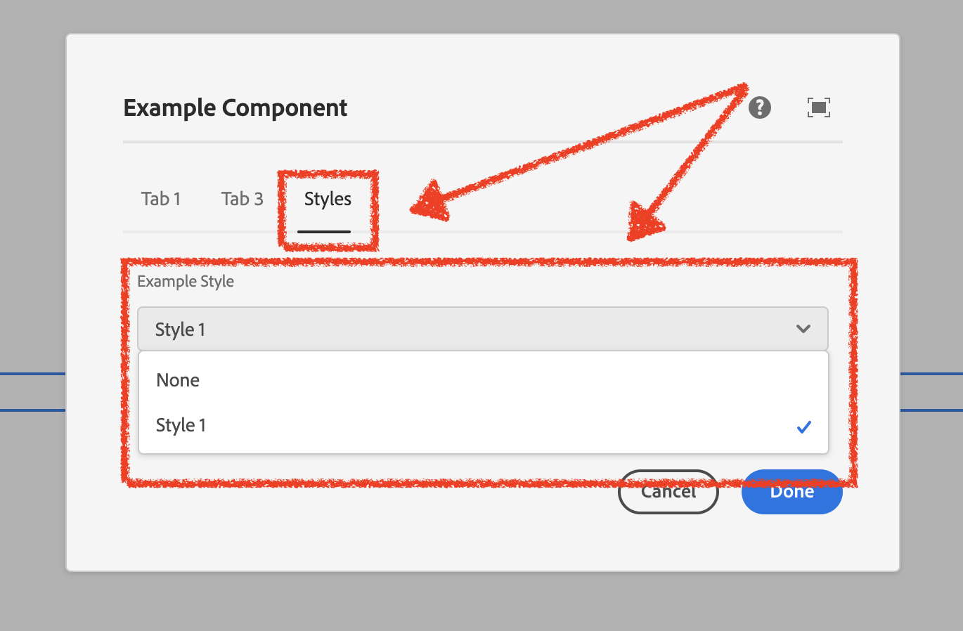
</jcr:root> - The result:
Last Thoughts
Enabling the AEM Style System is actually quite simple, but however, sometimes as a developer, you would like to access the configured properties fro the backend code to compute and execute code conditionally on what is configured. To learn how to obtain the style system AEM component configuration In the backend code, take a look at this blog, AEM Style System Component Information with Code Sling Models.

